Custom Form Elements in Angular
Tips to be faster than pre-built Design System or Rich UI libraries

Clearly, no one wants boilerplate in its code and there is no need to repeat your code over the time, however sometimes we need to customise components and our first choice is to choose a css framework, a prebuilt design system or a rich ui library.
But why we don’t create them from scratch? We may create our own component faster and we may reuse in a near future.
Introduction
We have to create this week for our department…

Our first thought is to start using Angular Material or Bootstrap…or Maybe Polymer or do a research for a similar web component or another kind of library to cover this form component…
In this post we will create agnostically, only Angular and our skills styling component
Let’s create
1. Generate it
$ ng g c text-field-form2. Style it
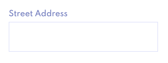
There are two elements the input and the descriptive field over the input
text-form-field.component.html
<span class="field">Street Address</span><input class="input" type="text" />
text-form-field.component.scss
@import '_fonts';
@import '_colors';:host {
    width: 240px;
    height: 73px;
    display: flex;
    flex-direction: column;
    justify-content: space-around;.field {
    @include font(12px, medium, 15px, -.25);
    color: $secondary-dark-1;
}.input {
    @include font(12px, bold, 15px, -.25);
    width: 240px;
    height: 48px;
    border: 1px solid $secondary-light-1;
 }
}
Tips here:
★ host: , so you don’t need to create a div wrapping all the elements in html
★ flex, you gain responsiveness in your components
★ font, create dry functions with Sass for less code
★ declare your principal colours as a variables
And here we are
Mmm wait look when we hover it, bad border and cursor right
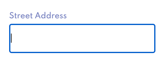
text-form-field.component.scss
....input {
   @include font(12px, bold, 15px, -.25);
   width: 240px;
   height: 48px;
   border: 1px solid $secondary-light-1;
   border-radius: 4px;
   caret-color: $primary-light-1;   &:focus {
      outline: none;
   }   &:hover, &:focus {
      border: 1px solid $primary-light-2;
   }
}...
Tips here:
★ caret-color and you style the cursor
★ outline, the you remove the blue border line inherit in all the inputs in html
★ hover and focus, you will have your border forever

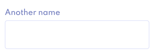
3. Field name parametizable
You can solve this with an @Input, however I see more elegant for spaced and long names to be passed through ng-content
text-form-field.component.ts
...control = new FormControl('');...
...somewhere.html
...<app-text-field-form>
   Another name
</app-text-field-form>...
4. Form Control, make it reactive and valid for Angular Forms
Get reactive power in your custom form component just with two lines!!!
text-form-field.component.ts
...control = new FormControl('');...
text-form-field.component.html
...<input class="input" type="text" [formControl]="control" />...
Final code
Next steps
We will see & learn in another post how to pass the value from the Form Control of the Form Component to its Parent Component, or just pass it like a FormGroup to build a bigger Form outside of it
Conclusion
If you try to build a very customise component with a library half of the times you’ll be faster from scratch.
Summarising create your own custom things sometimes would be better, I hope you see any tips valid for using in your projects.
We will cover other interesting topics of Angular soon or better we will show how we create nice thing together solving problems that we find in the way, so stay tuned!!!